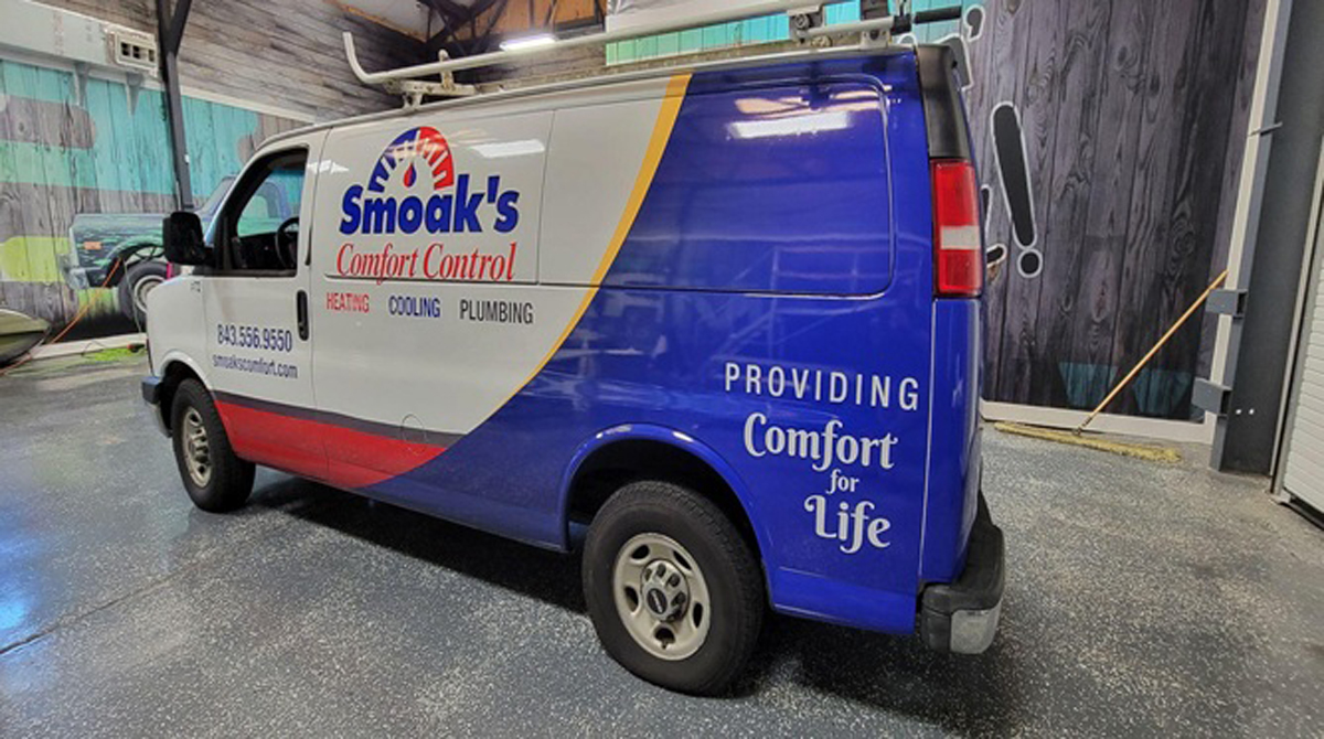
A vehicle wrap is one of the most effective forms of advertising because it reaches a wide audience, is cost-effective, and can be customized to nearly any specification. However, one of the most important aspects of a successful vehicle wrap is the design. In this blog post, we will explore some of the ways that design can impact a vehicle wrap.
But first, if you are interested in vehicle wraps in Charleston, SC, Carolina Wraps is the premier source for high-quality, custom vehicle wraps. We have a team of experienced designers who will work with you to create customized vehicle graphics in Charleston, SC that meets your specific needs and objectives.
Now, let’s take a look at how design can impact a vehicle wrap.
Bold Colors
The colors you chose for your vehicle wrap are important for a number of reasons. Bright colors are more likely to catch someone’s eye than more subdued colors, so it’s important to consider whether you want your vehicle wrap to be eye-catching or more understated. Contrasting colors allow text to be read faster and from greater distances.
For example, if your company colors are green and brown, using a green vehicle wrap with brown text would be difficult to read from a distance. However, if you reverse the colors (brown vehicle wrap with green text), the text will be much more visible. Avoid overlapping patterns that can be too “busy” looking.
Additionally, the colors you choose should be consistent with your brand identity. For example, if your company’s colors are black and white, you probably don’t want to use bright pink for your vehicle wrap! We’ll give you our guidance throughout the process.
Company Information
Your vehicle wrap should include some basic information about your company, such as your logo, website, and contact information. This way, anyone who sees your vehicle wrap will be able to easily learn more about your company and what you do. Additionally, we’ll make sure that this information is placed prominently on the vehicle wrap so that it can be easily seen and read.
Don’t include too much info because you want people to be able to read it quickly. The goal is for someone to be able to read your company information while they are stopped at a red light. Make sure the info is readable on both sides of the vehicle and the tailgate. A call to action like “Call us today!” or “Visit our website!” can have very quick results.
Text Size/Style
The text on your vehicle wrap should be easy to read from a distance. This means that you’ll want to use large font sizes and clear, legible fonts. It’s also important to keep the amount of text on your vehicle wrap to a minimum; too much text will make your vehicle wrap look cluttered and confusing.
Vehicle wraps in Charleston, SC can be customized to nearly any specifications (at least through the Carolina Wraps team!), so don’t hesitate to ask our team of designers for help in choosing the right text size and style for your vehicle wrap.
- You want your message easily read from approximately 50ft.
- Larger text ensures your message is readable by anyone near your vehicle whether you are driving or parked.
- Use the 10X1 rule (text with one-inch tall letters will be readable a max of 10ft away for each additional inch of letter height you gain another 10 ft of readability).
- The text style or font is also important. Use simple fonts like sans serif, Arial, or Helvetica.
- Stay away from scripts and fonts that look like handwriting because they are too difficult to read as you drive by at 55 mph.
Vehicle Size Is Important
The size of your vehicle will impact the design of your vehicle wrap. For example, a smaller car will require less vinyl than a larger truck. Additionally, the size of your vehicle will dictate how much space you have for graphics and text.
- You wouldn’t use the same design for a small VW bug on an 18-wheeler.
- The make and model of the vehicle are important as the design should incorporate the vehicle’s curves, slopes, and windows, etc.
- These intricacies can prove challenging for the design and installation. Designs with bleeds can allow greater flexibility and speed with the installation.
Vector Artwork Is Best
When designing your vehicle wrap, it’s important to use vector artwork instead of raster artwork. Vector artwork can be scaled up or down without losing quality, whereas raster artwork will become pixelated when enlarged. Don’t worry. We’ll do this for you.
This is especially important for vehicle wraps because they often need to be enlarged in order to fit the entire vehicle. By using vector artwork, you can avoid problems with pixelation or blurry graphics.
Conclusion
As you can see, there are many factors to consider when designing a vehicle wrap. From bold colors to vector artwork, each element plays an important role in the overall success of the campaign. By keeping these factors in mind, we can work together to create a vehicle wrap that is eye-catching, informative, and consistent with your brand identity.
So if you’re looking for vehicle wraps in Charleston, SC, Carolina Wraps is the company for you. We specialize in designing and installing high-quality vehicle wraps, and we would be happy to help you create a wrap that meets your needs.
Contact us today to get started!
